This assignment was part of a Graphic Design course for my BA. We were tasked with re-branding an existing entity, so I chose the Conflict Kitchen. This restaurant is based out of Philadelphia, and it tries to always make food from countries that the U.S. is currently in conflict with. It rotates it's menus quarterly and it also creates a new design with the new menu. I love the whole concept. I tried to re-create a menu that would allow for a full-service chain of restaurants. It would unite on the same design.
I drew inspiration from constructivist design and punk rock posters. Ultimately, I feel like my re-brand doesn't capture the essence of The Conflict Kitchen, but I enjoyed the project and the work involved.
Below is a logo lockup, color keys, and a business card iteration.

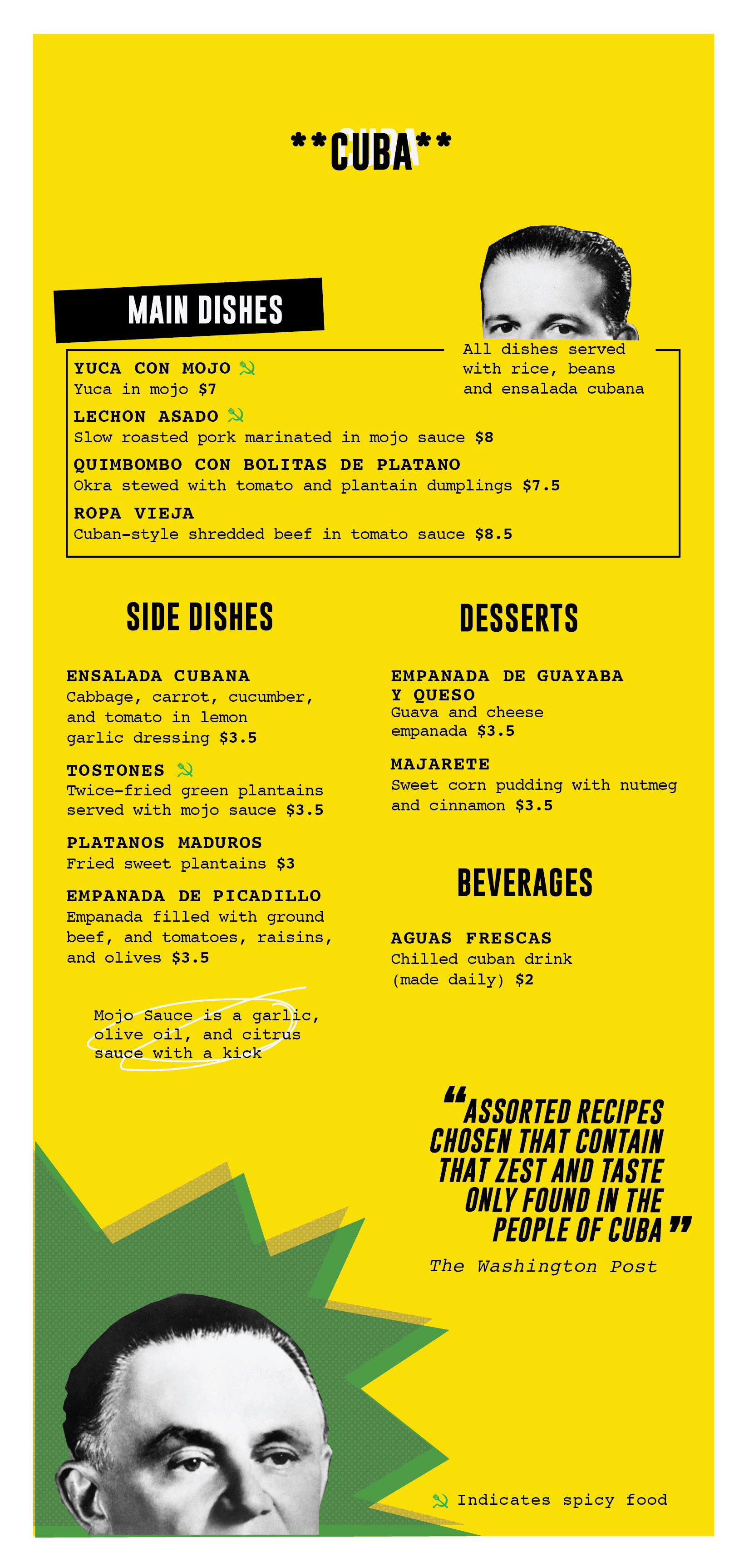
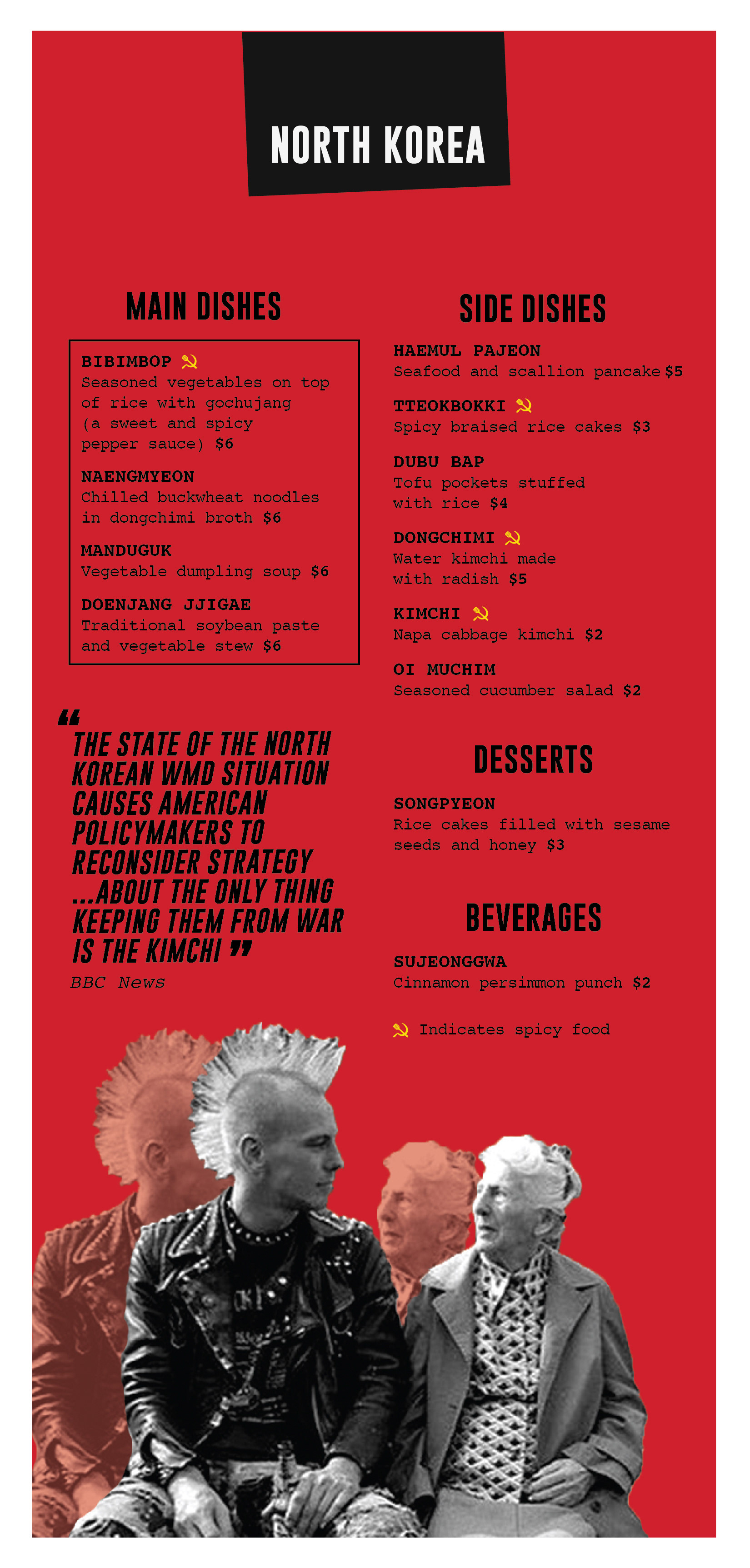
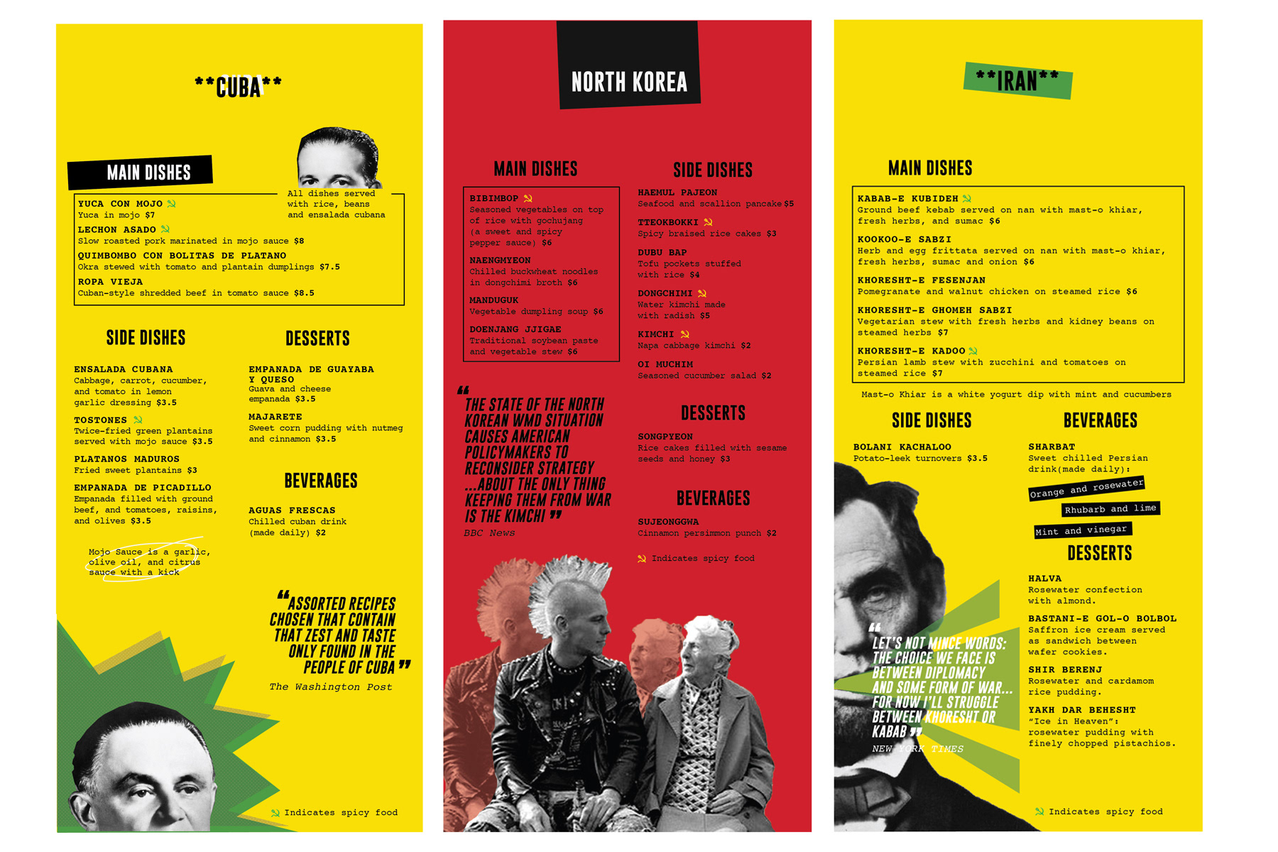
A tri-fold menu including items from the countries of Cuba, North Korea, and Iran. All quotes on the menus are made up, unlike those found on the coasters.
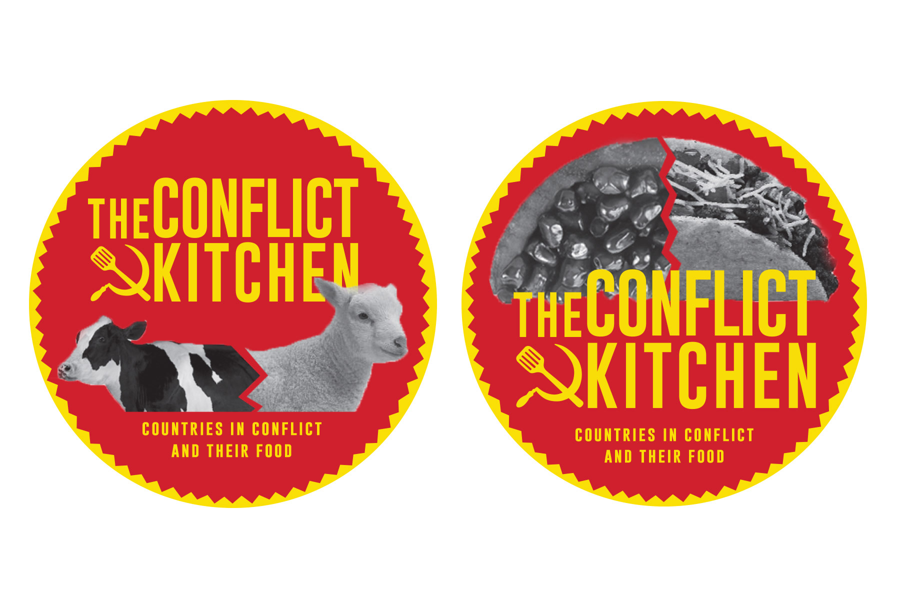
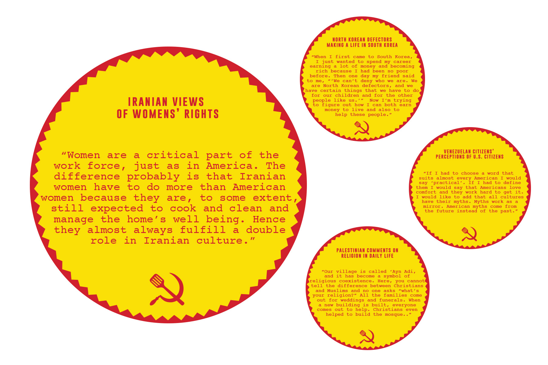
Coasters display the "collision" of foods on the front. The backside features quotes directly from local citizens of those countries.
Close ups of the menus in order.